
Novogene AMEA
  • Novogene AMEA
  • Genomics
    • Human Whole Genome Sequencing
    • Plant and Animal Whole Genome Sequencing
    • Microbial Whole Genome Sequencing
    • Plant and Animal De novo Sequencing
    • Microbial De novo Sequencing
    • Shotgun Metagenomics Sequencing
    • Amplicon Sequencing
    • Whole Exome Sequencing
    Transcriptomics
    • mRNA Sequencing
    • Total RNA Sequencing
    • Full-Length Transcriptome Sequencing
    • Whole Transcriptome Sequencing
    • Small RNA Sequencing
    • Circular RNA Sequencing
    • Metatranscriptome Sequencing
    • Prokaryotic RNA Sequencing
    Single Cell & Spatial Omics
    • Single Cell Gene Expression
    • Single Cell Immune Profiling Sequencing
    • Single Cell Long Read Transcriptome
    • Visium HD Spatial Gene Expression
    • Stereo-Seq Spatial Gene Expression
    • Xenium In Situ Spatial Transcriptome
    Epigenomics
    • Whole Genome Bisulfite Sequencing (WGBS)
    • Directed DNA Methylation Sequencing (DM-Seq) NEW
    • Reduced Representation Bisulfite Sequencing (RRBS)
    • Chromatin Immunoprecipitation Sequencing (ChIP-seq)
    • RNA Immunoprecipitation Sequencing (RIP-seq)
    • Assay for Transposase-Accessible Chromatin with Sequencing (ATAC-seq)

    Premade Library

    • Sequencing Only on Illumina Sequencer
    • Sequencing Only on PacBio Sequencer
    Proteomics and Metabolomics
    • Olink Proteomics
    • Quantitative Proteomics
    • Untargeted Metabolomics
  • PromotionsPromotions
    • Platforms
    • Automated Delivery Platform (Falcon)
    • Bioinformatics Analysis Tool (NovoMagic)
    • Customer Service System (CSS)
    • Brochures
    • Case Studies
    • Webinar
    • Blog
    • Sample Guidelines
    • Cancer Research
    • Immuno-oncology
    • Agrigenomics
    • Environment
    • Food Science
    • Human Microbiome
    • Plant and Animal Microbiome
    • Drug Discovery and Development
    • Rare and Complex Diseases
    • About Us
    • Our Locations
    • News
    • Careers
  • Contact UsContact Us
  1. Home
  2. Resources
  3. Blog
  4. GEO Data Mining (II) - Differential gene expression analysis and visualization with complete code sharing

GEO Data Mining (II) - Differential gene expression analysis and visualization with complete code sharing

In the previous two articles, “” and “,” we shared procedures and code for downloading sequence data. Now that we have the data, we can begin mining it. This article covers how to extract the downloaded sequence data, perform differential gene expression (DGE) analyses, find up-regulated and down-regulated genes, and then visualize changes in gene expression.

Why is differential expression analysis of genes valuable? During tumor pathogenesis or the progress of other diseases, gene expression can change. Some genes that were originally silent may become highly expressed, while other genes that were originally expressed normally may have increased or decreased expression in experimental samples. Genes that have altered expression levels compared with normal samples may control or affect tumorigenesis. Therefore, to study tumorigenesis mechanisms, investigators need to set up case (experiment or treatment) and control (control) groups for DGE analysis, explore the differentially expressed genes that characterize the treatment group and the control group, and construct gene enrichment pathways to study the pathogenesis of tumors. Then investigators can focus on interpreting these enriched pathways and explore the relationship or internal mechanism between these pathways and the phenotype of the sample.

Through the following four steps, we present a complete set of shared code for differential gene expression analysis and visualization:

Step 1: Extract expression matrix, clinical information, and chip number

The original data we downloaded, including metadata, constitutes the “eSet”. We will use the method of subsetting the list to extract the first element in the eSet list: eSet[[1]]. We will also use the “exprs” function to convert it into a matrix, usually using head (100) to determine whether the data needs to be converted to log type.

#(1) Extract expression matrix exp—-

exp <- exprs(eSet[[1]]) exp[1:4,1:4] #exp = log2(exp+1) #Judge whether log2 is needed

#(2) Extract clinical information —- The clinical information of each sample can be obtained by using the pData() function. Usually, the source column (source) or feature column (characteristics”) of the data frame will describe which samples are control or treatment.

pd <- pData(eSet[[1]])

#(3) Extract chip platform number —- The data usually use different chip probes, which are subsequently converted into entrez ID or symbol ID according to the GEO Platform (GPL) number. The NCBI database’s official name for the gene is represented by the Entrez ID. The HGNC database’s official name for the gene is represented by the symbol ID.

gpl <- eSet[[1]]@annotation p = identical(rownames(pd),colnames(exp)) save(gse,exp,pd,gpl,file = “step1_output.Rdata”)#Save the result

Step 2: Build grouping, chip annotation

1. Build group information The Rdata from Step 1 are grouped according to the sample source information in the GEO Series (GSE).

rm(list = ls()) load(“step1_output. Rdata”) library(stringr) table(colnames(exp)) group_list = ifelse(str_detect(pd$source_name_ch1,”tumor”),”test”,”normal”) group_list=factor(group_list, levels = c(“test”,”normal”)) group_list table(group_list)

2. Chip annotation of GLP

if(T){ a = getGEO(gpl,destdir = “.”) b = a@dataTable@table colnames(b) ids2 = b[,c(“ID”,”GENE_SYMBOL”)] colnames(ids2) = c(“probe_id”,”symbol”) ids2 = ids2[ids2$symbol!=”” & !str_detect(ids2$symbol,”///”),] } save(group_list,ids2,exp,pd,file = “step2_output.Rdata”)

Step 3: Data inspection – Principal Component Analysis

Next, perform principal component analysis (PCA) with the FactoMineR, factoextra package to determine whether there is a significant grouping between treatment and control groups. Use the code below to draw a PCA plot.

#Import the Rdata results of the first two steps

rm(list = ls())#clear the environment load(“step1_output. Rdata”) load(“step2_output. Rdata”) dat=as.data.frame(t(exp)) library(FactoMineR) library(factoextra) # Unified operation of pca dat.pca <- PCA(dat, graph = FALSE) pca_plot <- fviz_pca_ind(dat.pca, geom.ind = “point”, # show points only (nbut not “text”) col.ind = group_list, # color by groups palette = c(“#00AFBB”, “#E7B800”), addEllipses = TRUE, # Concentration ellipses legend.title = “Groups” ) print(pca_plot) ggsave(plot = pca_plot, filename = paste0(gse,”PCA.png”)) save(pca_plot, file = “pca_plot. Rdata”)
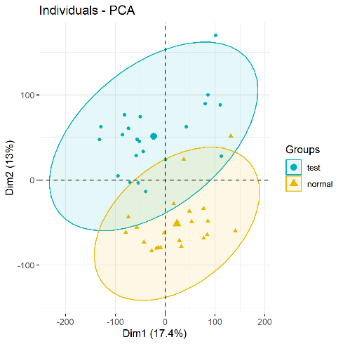
PCA plots(significant difference between subgroups of data)

Step 4: Differential gene expression analysis and visualization – volcano map and heat map

Next, import the Rdata from Steps 1 and 2, and use the limma package to perform differential gene expression (DGE) analysis on each gene. DGE analysis includes determining log fold change (logFC) of a gene, average expression level, and whether the p value is significant. DGE analysis uses two main input files: (1) the organized expression matrix, in which the row name is the gene name and the column name is the sample name; and (2) grouping information (group list).

DGE analysis with the limma package is divided into three steps: lmFit, eBayes, and topTable. Using the limma package requires three types of data: (1) Expression matrix exp grouping matrix; (2) Design difference comparison matrix; and (3) Contrast.matrix to get the differential analysis matrix (nrDEG). The analysis results focus on logFC and p value.

rm(list = ls()) load(“step1_output. Rdata”) load(“step2_output. Rdata”)

1. Differential gene expression analysis

library(limma) design=model.matrix(~group_list) fit=lmFit(exp, design) fit=eBayes(fit) deg=topTable(fit, coef=2, number = Inf) head(deg)

2. Add a few columns to the deg data frame

#1. Add the probe_id column and turn the row name into a column library(dplyr) deg <- mutate(deg,probe_id=rownames(deg)) #tibble::rownames_to_column() head(deg) #merge merges two tables table(deg$probe_id %in% ids$probe_id) #deg ​​<- inner_join(deg,ids,by=”probe_id”) deg <- merge(x = deg,y = ids2, by=”probe_id”) deg <- deg[!duplicated(deg$symbol),] dim(deg) #2. Add change column: up or down, the volcano map should be used #logFC_t=mean(deg$logFC)+2*sd(deg$logFC) logFC_t=1.5 change=ifelse(deg$P.Value>0.05,’stable’, ifelse( deg$logFC >logFC_t,’up’, ifelse( deg$logFC < -logFC_t,’down’,’stable’) ) ) deg <- mutate(deg, change) head(deg) table(deg$change)

3. Add the ENTREZID column, which will be used later in the enrichment analysis

library(ggplot2) library(clusterProfiler) library(org.Hs.eg.db) s2e <- bitr(unique(deg$symbol), fromType = “SYMBOL”, toType = c( “ENTREZID”), OrgDb = org.Hs.eg.db) head(s2e) head(deg) deg <- inner_join(deg,s2e,by=c(“symbol”=”SYMBOL”)) head(deg) save(logFC_t,deg,file = “step4_output.Rdata”)

Data visualization- volcano map, heat map

Several different types of graphs are available to visualize differential gene expression data, including volcano maps and heat maps.

rm(list = ls()) load(“step1_output. Rdata”) load(“step2_output. Rdata”) load(“step4_output. Rdata”) library(dplyr)

1.Volcano map

dat <- mutate(deg,v=-log10(P.Value)) if(T){ for_label <- dat%>% filter(symbol %in% c(“RUNX2″,”FN1”)) } if(F){ for_label <- dat %>% head(10) } if(F) { x1 = dat %>% filter(change == “up”) %>% head(3) x2 = dat %>% filter(change == “down”) %>% head(3) for_label = rbind(x1,x2) } p <- ggplot(data = dat, aes(x = logFC, y = v)) + geom_point(alpha=0.4, size=3.5, aes(color=change)) + ylab(“-log10(Pvalue)”)+ scale_color_manual(values=c(“blue”, “grey”,”red”))+ geom_vline(xintercept=c(-logFC_t,logFC_t),lty=4,col=”black”,lwd=0.8) + geom_hline(yintercept = -log10(0.05), lty=4, col=”black”, lwd=0.8) + theme_bw() p volcano_plot <- p + geom_point(size = 3, shape = 1, data = for_label) + ggrepel::geom_label_repel( aes(label = symbol), data = for_label, color=”black” ) volcano_plot ggsave(plot = volcano_plot, filename = paste0(gse,”volcano.png”))
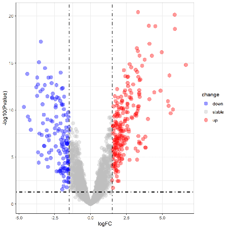
Volcano plot(Upregulation & Downregulation in Gene Expression)

2. Draw a heatmap

cg=names(tail(sort(apply(exp,1,sd)),1000)) n=exp[cg,] annotation_col=data.frame(group=group_list) rownames(annotation_col) = colnames(n) library(pheatmap) heatmap_plot <- pheatmap(n, show_colnames=F, show_rownames = F, annotation_col = annotation_col, scale = “row”) # save the result library(ggplot2) png(file = paste0(gse,”heatmap.png”)) ggsave(plot = heatmap_plot, filename = paste0(gse,”heatmap.png”)) dev.off()
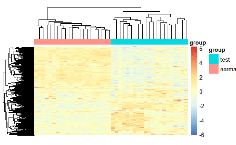
Heatmap(Measuring similarity of expression between subgroups)

At present, we have completed the differential gene expression analysis and visualization part of GEO data mining and have obtained significantly up-regulated and down-regulated differentially expressed genes. However, disease occurrence is often affected by more than one gene. For more tools to assist in studying disease and cancer mechanisms, stay tuned for our next tutorial on GEO data mining and identifying gene expression pathways.

ServicesServices menu

SupportSupport menu

CompanyCompany menu

Services
Whole Genome SequencingDe novo SequencingAmplicon SequencingShotgun Metagenomic SequencingDirected DNA Methylation Sequencing (DM-Seq)mRNA SequencingSingle Cell Gene ExpressionVisium HD Spatial Gene ExpressionXenium In Situ Spatial TranscriptomeOlink ProteomicsUntargeted Metabolomics
Support
NovoMagic Bioinformatics Analysis ToolCustomer Service SystemFalcon Intelligent Delivery Platform
Company
About UsOur LocationsOur PlatformsNewsCareersContact Us
LinkedInLinkedIn hoverYouTubeYouTube hoverXX hover
Copyright © 2026 Novogene Inc. All rights reserved.For Research Use Only. Not for Clinical Diagnostic Use.
Novogene AMEA
  • Novogene AMEA
  • Genomics
    • Human Whole Genome Sequencing
    • Plant and Animal Whole Genome Sequencing
    • Microbial Whole Genome Sequencing
    • Plant and Animal De novo Sequencing
    • Microbial De novo Sequencing
    • Shotgun Metagenomics Sequencing
    • Amplicon Sequencing
    • Whole Exome Sequencing
    Transcriptomics
    • mRNA Sequencing
    • Total RNA Sequencing
    • Full-Length Transcriptome Sequencing
    • Whole Transcriptome Sequencing
    • Small RNA Sequencing
    • Circular RNA Sequencing
    • Metatranscriptome Sequencing
    • Prokaryotic RNA Sequencing
    Single Cell & Spatial Omics
    • Single Cell Gene Expression
    • Single Cell Immune Profiling Sequencing
    • Single Cell Long Read Transcriptome
    • Visium HD Spatial Gene Expression
    • Stereo-Seq Spatial Gene Expression
    • Xenium In Situ Spatial Transcriptome
    Epigenomics
    • Whole Genome Bisulfite Sequencing (WGBS)
    • Directed DNA Methylation Sequencing (DM-Seq) NEW
    • Reduced Representation Bisulfite Sequencing (RRBS)
    • Chromatin Immunoprecipitation Sequencing (ChIP-seq)
    • RNA Immunoprecipitation Sequencing (RIP-seq)
    • Assay for Transposase-Accessible Chromatin with Sequencing (ATAC-seq)

    Premade Library

    • Sequencing Only on Illumina Sequencer
    • Sequencing Only on PacBio Sequencer
    Proteomics and Metabolomics
    • Olink Proteomics
    • Quantitative Proteomics
    • Untargeted Metabolomics
  • PromotionsPromotions
    • Platforms
    • Automated Delivery Platform (Falcon)
    • Bioinformatics Analysis Tool (NovoMagic)
    • Customer Service System (CSS)
    • Brochures
    • Case Studies
    • Webinar
    • Blog
    • Sample Guidelines
    • Cancer Research
    • Immuno-oncology
    • Agrigenomics
    • Environment
    • Food Science
    • Human Microbiome
    • Plant and Animal Microbiome
    • Drug Discovery and Development
    • Rare and Complex Diseases
    • About Us
    • Our Locations
    • News
    • Careers
  • Contact UsContact Us
  1. Home
  2. Resources
  3. Blog
  4. GEO Data Mining (II) - Differential gene expression analysis and visualization with complete code sharing

GEO Data Mining (II) - Differential gene expression analysis and visualization with complete code sharing

In the previous two articles, “” and “,” we shared procedures and code for downloading sequence data. Now that we have the data, we can begin mining it. This article covers how to extract the downloaded sequence data, perform differential gene expression (DGE) analyses, find up-regulated and down-regulated genes, and then visualize changes in gene expression.

Why is differential expression analysis of genes valuable? During tumor pathogenesis or the progress of other diseases, gene expression can change. Some genes that were originally silent may become highly expressed, while other genes that were originally expressed normally may have increased or decreased expression in experimental samples. Genes that have altered expression levels compared with normal samples may control or affect tumorigenesis. Therefore, to study tumorigenesis mechanisms, investigators need to set up case (experiment or treatment) and control (control) groups for DGE analysis, explore the differentially expressed genes that characterize the treatment group and the control group, and construct gene enrichment pathways to study the pathogenesis of tumors. Then investigators can focus on interpreting these enriched pathways and explore the relationship or internal mechanism between these pathways and the phenotype of the sample.

Through the following four steps, we present a complete set of shared code for differential gene expression analysis and visualization:

Step 1: Extract expression matrix, clinical information, and chip number

The original data we downloaded, including metadata, constitutes the “eSet”. We will use the method of subsetting the list to extract the first element in the eSet list: eSet[[1]]. We will also use the “exprs” function to convert it into a matrix, usually using head (100) to determine whether the data needs to be converted to log type.

#(1) Extract expression matrix exp—-

exp <- exprs(eSet[[1]]) exp[1:4,1:4] #exp = log2(exp+1) #Judge whether log2 is needed

#(2) Extract clinical information —- The clinical information of each sample can be obtained by using the pData() function. Usually, the source column (source) or feature column (characteristics”) of the data frame will describe which samples are control or treatment.

pd <- pData(eSet[[1]])

#(3) Extract chip platform number —- The data usually use different chip probes, which are subsequently converted into entrez ID or symbol ID according to the GEO Platform (GPL) number. The NCBI database’s official name for the gene is represented by the Entrez ID. The HGNC database’s official name for the gene is represented by the symbol ID.

gpl <- eSet[[1]]@annotation p = identical(rownames(pd),colnames(exp)) save(gse,exp,pd,gpl,file = “step1_output.Rdata”)#Save the result

Step 2: Build grouping, chip annotation

1. Build group information The Rdata from Step 1 are grouped according to the sample source information in the GEO Series (GSE).

rm(list = ls()) load(“step1_output. Rdata”) library(stringr) table(colnames(exp)) group_list = ifelse(str_detect(pd$source_name_ch1,”tumor”),”test”,”normal”) group_list=factor(group_list, levels = c(“test”,”normal”)) group_list table(group_list)

2. Chip annotation of GLP

if(T){ a = getGEO(gpl,destdir = “.”) b = a@dataTable@table colnames(b) ids2 = b[,c(“ID”,”GENE_SYMBOL”)] colnames(ids2) = c(“probe_id”,”symbol”) ids2 = ids2[ids2$symbol!=”” & !str_detect(ids2$symbol,”///”),] } save(group_list,ids2,exp,pd,file = “step2_output.Rdata”)

Step 3: Data inspection – Principal Component Analysis

Next, perform principal component analysis (PCA) with the FactoMineR, factoextra package to determine whether there is a significant grouping between treatment and control groups. Use the code below to draw a PCA plot.

#Import the Rdata results of the first two steps

rm(list = ls())#clear the environment load(“step1_output. Rdata”) load(“step2_output. Rdata”) dat=as.data.frame(t(exp)) library(FactoMineR) library(factoextra) # Unified operation of pca dat.pca <- PCA(dat, graph = FALSE) pca_plot <- fviz_pca_ind(dat.pca, geom.ind = “point”, # show points only (nbut not “text”) col.ind = group_list, # color by groups palette = c(“#00AFBB”, “#E7B800”), addEllipses = TRUE, # Concentration ellipses legend.title = “Groups” ) print(pca_plot) ggsave(plot = pca_plot, filename = paste0(gse,”PCA.png”)) save(pca_plot, file = “pca_plot. Rdata”)

PCA plots(significant difference between subgroups of data)

Step 4: Differential gene expression analysis and visualization – volcano map and heat map

Next, import the Rdata from Steps 1 and 2, and use the limma package to perform differential gene expression (DGE) analysis on each gene. DGE analysis includes determining log fold change (logFC) of a gene, average expression level, and whether the p value is significant. DGE analysis uses two main input files: (1) the organized expression matrix, in which the row name is the gene name and the column name is the sample name; and (2) grouping information (group list).

DGE analysis with the limma package is divided into three steps: lmFit, eBayes, and topTable. Using the limma package requires three types of data: (1) Expression matrix exp grouping matrix; (2) Design difference comparison matrix; and (3) Contrast.matrix to get the differential analysis matrix (nrDEG). The analysis results focus on logFC and p value.

rm(list = ls()) load(“step1_output. Rdata”) load(“step2_output. Rdata”)

1. Differential gene expression analysis

library(limma) design=model.matrix(~group_list) fit=lmFit(exp, design) fit=eBayes(fit) deg=topTable(fit, coef=2, number = Inf) head(deg)

2. Add a few columns to the deg data frame

#1. Add the probe_id column and turn the row name into a column library(dplyr) deg <- mutate(deg,probe_id=rownames(deg)) #tibble::rownames_to_column() head(deg) #merge merges two tables table(deg$probe_id %in% ids$probe_id) #deg ​​<- inner_join(deg,ids,by=”probe_id”) deg <- merge(x = deg,y = ids2, by=”probe_id”) deg <- deg[!duplicated(deg$symbol),] dim(deg) #2. Add change column: up or down, the volcano map should be used #logFC_t=mean(deg$logFC)+2*sd(deg$logFC) logFC_t=1.5 change=ifelse(deg$P.Value>0.05,’stable’, ifelse( deg$logFC >logFC_t,’up’, ifelse( deg$logFC < -logFC_t,’down’,’stable’) ) ) deg <- mutate(deg, change) head(deg) table(deg$change)

3. Add the ENTREZID column, which will be used later in the enrichment analysis

library(ggplot2) library(clusterProfiler) library(org.Hs.eg.db) s2e <- bitr(unique(deg$symbol), fromType = “SYMBOL”, toType = c( “ENTREZID”), OrgDb = org.Hs.eg.db) head(s2e) head(deg) deg <- inner_join(deg,s2e,by=c(“symbol”=”SYMBOL”)) head(deg) save(logFC_t,deg,file = “step4_output.Rdata”)

Data visualization- volcano map, heat map

Several different types of graphs are available to visualize differential gene expression data, including volcano maps and heat maps.

rm(list = ls()) load(“step1_output. Rdata”) load(“step2_output. Rdata”) load(“step4_output. Rdata”) library(dplyr)

1.Volcano map

dat <- mutate(deg,v=-log10(P.Value)) if(T){ for_label <- dat%>% filter(symbol %in% c(“RUNX2″,”FN1”)) } if(F){ for_label <- dat %>% head(10) } if(F) { x1 = dat %>% filter(change == “up”) %>% head(3) x2 = dat %>% filter(change == “down”) %>% head(3) for_label = rbind(x1,x2) } p <- ggplot(data = dat, aes(x = logFC, y = v)) + geom_point(alpha=0.4, size=3.5, aes(color=change)) + ylab(“-log10(Pvalue)”)+ scale_color_manual(values=c(“blue”, “grey”,”red”))+ geom_vline(xintercept=c(-logFC_t,logFC_t),lty=4,col=”black”,lwd=0.8) + geom_hline(yintercept = -log10(0.05), lty=4, col=”black”, lwd=0.8) + theme_bw() p volcano_plot <- p + geom_point(size = 3, shape = 1, data = for_label) + ggrepel::geom_label_repel( aes(label = symbol), data = for_label, color=”black” ) volcano_plot ggsave(plot = volcano_plot, filename = paste0(gse,”volcano.png”))

Volcano plot(Upregulation & Downregulation in Gene Expression)

2. Draw a heatmap

cg=names(tail(sort(apply(exp,1,sd)),1000)) n=exp[cg,] annotation_col=data.frame(group=group_list) rownames(annotation_col) = colnames(n) library(pheatmap) heatmap_plot <- pheatmap(n, show_colnames=F, show_rownames = F, annotation_col = annotation_col, scale = “row”) # save the result library(ggplot2) png(file = paste0(gse,”heatmap.png”)) ggsave(plot = heatmap_plot, filename = paste0(gse,”heatmap.png”)) dev.off()

Heatmap(Measuring similarity of expression between subgroups)

At present, we have completed the differential gene expression analysis and visualization part of GEO data mining and have obtained significantly up-regulated and down-regulated differentially expressed genes. However, disease occurrence is often affected by more than one gene. For more tools to assist in studying disease and cancer mechanisms, stay tuned for our next tutorial on GEO data mining and identifying gene expression pathways.

ServicesServices menu

SupportSupport menu

CompanyCompany menu

Services
Whole Genome SequencingDe novo SequencingAmplicon SequencingShotgun Metagenomic SequencingDirected DNA Methylation Sequencing (DM-Seq)mRNA SequencingSingle Cell Gene ExpressionVisium HD Spatial Gene ExpressionXenium In Situ Spatial TranscriptomeOlink ProteomicsUntargeted Metabolomics
Support
NovoMagic Bioinformatics Analysis ToolCustomer Service SystemFalcon Intelligent Delivery Platform
Company
About UsOur LocationsOur PlatformsNewsCareersContact Us
LinkedInLinkedIn hoverYouTubeYouTube hoverXX hover
Copyright © 2026 Novogene Inc. All rights reserved.For Research Use Only. Not for Clinical Diagnostic Use.
Privacy PolicyCookie PolicyCareers